Greetings dear photography enthusiast!
I hope my posts have been entertaining as well as informative for you until now. Having cleared misunderstandings and myths regarding camera equipment, I believe it is time I got down to talking about photography and moving away from the topic of equipment for a while.
So you are all geared up to take up the challenge of mastering the art eh? Glad to hear that. Keep that josh simmering my friend, cause no reward is greater than the fruit of a pursuit of excellence!
Let me talk about a few fundas of photography to get you started. This post is aimed at novice enthusiasts who are wondering if they are on the right track of learning. So I will try to keep it very basic and explanatory with lots of links to articles as and where necessary.
This post will explore the concepts related to image composition - what should and what shouldn't be in the frame.
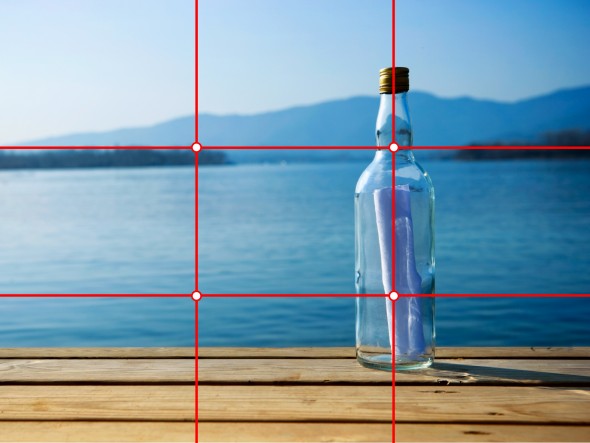
Rule of thirds
A very commonly discussed rule in creative circles is the rule of thirds. This is not a rule per say, rather a guideline to help you compose/frame your pictures to make them look appealing and to add a sense of subject and message to it. Of course, as a creative person you are not bound by rules and hence are free to make your own rules or to not follow suggested approaches but then, the rule of thirds is a very common rule that does give birth to deeply communicative images. Some articles claim that research has yielded evidence of the fact that when most people look at an image, their eyes start at one of the four focus points that the rule of thirds yields. This theory completely applies to me and hence, I believe that this rule is not a hallucination of an intoxicated artist but is in fact, based on factual observations.
So what is this cosmic rule of thirds? Its very simple. Divide your image into 3x3 sections so that you get 9 cells as shown in the below image. The 4 intersection points formed around the central area of the image are the focus points that I was talking about. Chances are, placing your subject at one of these focus points will make the user note the subject before he/she notices anything else.
Check out the set of images below. The one of the right follows the rule of thirds. Which one would you have shot?
 |
| Image Courtesy: slideguru.com |
 | ||
| Image Courtesy: Wikipedia |
Which of these images looks more appealing to you? I personally prefer the one on the right. Coincidentally, this image follows the rule of thirds. You will notice that the one on the right is a little lower than the other one and is shifted towards the left. This removes the unnecessary brown sand at the bottom of the screen and brings the focus on the towering rock which was the intended subject even in the picture on the left.
As I said before, the rule of thirds is just a guideline that you should be aware of. The appeal of the image is not dependent on this rule. Listed below are some images which follow/don't follow the rule of thirds.


The above image follows the rule of thirds. Notice how the attention is drawn not only to the person standing in the image but also to the sky and the landscape. As can be inferred from this, the rule of thirds can be used to draw attention to the environment of the subject (the landscape/friends/objects around the subject) while also drawing attention to the subject.

The above image defies the rule of thirds because the aim of the photographer is to draw attention to the subject only. Had the subject been shifted to one of the corners, the viewer would have been confused as to what the photographer wants to show besides the subject since there is no concrete/beautiful scenery in the vicinity of the subject.

The above image defies the rule of thirds because the aim of the photographer is to draw attention to the subject only. Had the subject been shifted to one of the corners, the viewer would have been confused as to what the photographer wants to show besides the subject since there is no concrete/beautiful scenery in the vicinity of the subject.
Depth-of-Field (dof)
Dof is the width of the plane near the subject, that is parallel to the surface of the camera lens. Look at the illustration below to understand this definition. dof is varied by altering the aperture setting of the camera. Aperture is measure in f-stops. For example, f1.8, f3.6, etc. f1.8 provides shallow dof as compared to a higher number like f3.6 and so on.

In the above image, the gray area is the dof around the subject. Objects outside the dof will not be as sharp as the objects inside the dof and the level of sharpness in these objects will increase with their distance from the dof area. For example, a vase placed just outside the dof area behind the subject will be a bit less sharp while a vase placed 5 metres behind this vase will be quite out of focus. When the dof plane width is small, the term used for such a setting is "shallow dof" since the area in which the image is sharp is shallow/small. "Increasing the dof" means increasing the width of the dof plane.
Please not that the dof plane is always created parallel to the surface of the lens. So if you have a string of people standing in front of the lens at varying perpendicular distances from the lens and you focus on the person in the middle of the lot, all those who are in the dof plane will appear sharp in the image. People who are a step or two forward or behind the person in the middle will start appearing out of focus.
Dof is most useful and produces appealing images during portfolio shots where you want to focus on one person in a crowd. This could be the groom/bride or even just the wedding ring. One of my favorite wedding photographers Joseph Radhik routinely employes the dof funda to his image to produce fantabulous results!


Notice that the background in the above image is out of focus. This is because of shallow dof. As mentioned above, shallow dof produces awesome effects in portfolio shots.
Reduce clutter
Do not stuff your image with too many subjects. Keep it clean. When I look at your image, my eyes should not wander around in search of the subject. Your image should guide my eyes to your subjects. For example, I consider the below image cluttered. I cannot decide what or who the subject is.
 |
| Image Courtesy : tibetanwomen.org |
In the below image, we know what or who the photographer is trying to point at. It is the six people in the image. There is no other subject/distraction in the image that can make you think otherwise. Of course, this is a studio-staged image and hence you could do away with the clutter and this is usually not possible in candid pics like the one above but nevertheless, I have used it to explain the difference that clutter makes.
 |
| Image Courtesy: Wordpress |
Notice that even if you have clutter in the image, you can shut them out of the viewer's focus area by either darkening it or by blurring it. These are post-processing options which are to be the last resort and should not be considered while clicking the image. Below, the image on the right has a background that distracts the viewer. The one on the left has that background darkened out in post-processing to help the viewer focus on the intended subjects - the bells.


Silhouettes
With respect to photography, a silhouette is identified as a dark image outline against a brighter background. For example, the dark, unrecognizable snapshot of a person against the orange setting sky in the evening. Silhouettes create a mystic feel about the identity and persona of the person being included in the image and usually leaves it to the viewer to draw a meaning out of the image.

Seedha ya tedha?
Here I am talking about shooting an image in portrait or landscape mode. You need to use your own judgement of what would capture the subject properly and convey what you want to. Check out this article on this topic. A landscape image has the capability of showcasing more the the situation and hence provided a more complete picture whereas a portrait image has the capability of showcasing few selected subjects that you want the viewer to focus on. Depending on what it is that you want to portray, choose the mode. Once again, either mode may produce a good image but both modes may not convey the same thing or make the user see the same thing that you want them to.
In the above image, much of the detail to the left of the scenario has been lost because the photographer tried to include the subject as well as much of the background on the right. This has been corrected by moving a few steps back and capturing a portrait shot instead. The portrait shot makes the subject look smaller as compared to his surroundings but looks much more visually appealing and more importantly, complete.

Leading Lines
I don't really know how to best explain this concept. It is about using lines or structures that form a linear arrangement which give the viewer the idea that the photographer is trying to point towards something using the subjects in the image. Check out the below images for example.


Point of view concepts
There are different positions in the room that you can capture the subject from. You can lie on the ground, or kneel, or climb up a ladder, or get behind the subject and show his/her back instead of the face and other innumerable positions. Here is a wonderful and somewhat comprehensive article on this topic. Try not to be monotonous in your point of view. For example, I see wedding photographers permanently perched in front of the wedding podium clicking pictures from just one position throughout the wedding. I have no interest in looking through the same angle throughout the entire album. The album should give me a tour of the wedding day. And a tour requires the camera to move from one position to another. So my word of advice is - move your feet, roll in the muck, climb the trees and break the cliche.
So these were some of the composition related concepts that I could delve upon at the moment. There are many more but they are better left for another day. I hope this article adds to your creative mind and helps you be artistic with your captures.
Happy clickin!
Sid
No comments:
Post a Comment